Complicity’s Roving Eye: The Cinematography of “The Big Short”

Every American should make it a point to see “The Big Short”…

That was the first sentiment expressed by a close friend of mine when I told her that I finally sat down and watched it this past week, and one that I wholeheartedly agreed with.  Not only was it a film that I enjoyed far more then I thought I would, it was also one that for what it’s worth I was downright impressed with.  If years ago while watching “Anchorman”, “Talledega Nights”, or “Step Brothers” you would have told me that the director of these films would later go on to direct a largely serious, yet easy to digest take on the credit/housing bubble collapse of 2008 I’m not sure if I would have believed you.

The-Big-Short-5 

Adam McKay did just this with 2015’s “The Big Short”, a film that earned him an Oscar win for “Best Adapted Screenplay”, and one which will undoubtedly give him the option to move his career into realms outside of the ones that feature Will Farrell playing some form of hilariously overbearing man-child, (not that there’s anything wrong with that).

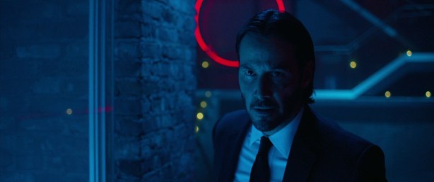
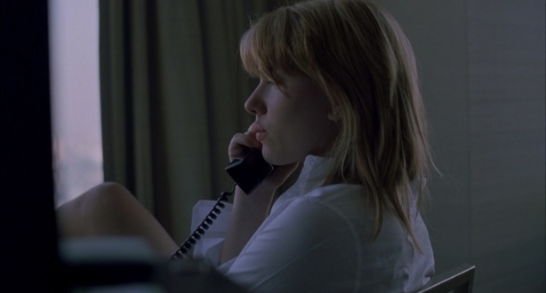
At first glance I was ready to chalk up “The Big Short’s” cinematography as “workman-like”, no doubt beautifully executed but still nothing flashy. Certainly the way it should have been in order to best serve the story it’s trying to tell.  However, it wasn’t long into the film’s 130 minute run time that I began to notice that there was more going on beneath the surface with Director of Photography Barry Ackroyd’s visuals then I initially thought.  In this case it had less to do with the lighting and more to do with the camera work, and is fairly well represented in the scene below…

to call Ackroyd’s camerawork “frenetic” at times may be an overstatement, though it isn’t far off the mark. Handheld camera aesthetics are commonplace in cinema created at every budget level, but pulling it off so that isn’t over done to the point of annoyance can be a difficult line to walk.  Throughout the entirety of “The Big Short” the camera is on the move to the point at which it would be accurate, (if not a little cliche) to say that the camera itself becomes a character in its own right.

the-big-short-movie-photo-7

I’m of the opinion that McKay and his team were successful in the implementation of their moving camera, managing to not overwhelm the proceedings with its presence.  In my viewing experience the roving camera adds an energy to a narrative that is largely conversation over action.  It effectively brings the audience into this high stakes world, dropping us into the offices and conference rooms right along side the other characters.

Film+Review-The+Big+Short

Ever drifting, panning, and refocusing, the camera serves as our eyes – always shifting viewpoints in an effort to keep up with the information that we are becoming privy to, as well as to the plans that are being unhatched.  By the end of the film the audience can’t help but to feel as if they’ve been right there with the characters all along. We’re a silent partner in their same schemes; an accomplish in their less then above boards gains.

The last scenes leave us with Steve Carell’s Mark Baum, (arguably the most sympathetic of the bunch) left depressed and despondent once the realization of just what has just happened to his industry and the millions it affects.  All at once we can’t help feeling the same rage at the machine that he does, while at the same time trying not to admit to ourselves that in a way we could all be more then a little complicit in what’s come to pass.

the-big-short-movie-still-10

Chris Magdalenski is a cinematographer and visual designer currently working in NYC. View demo reel here – https://vimeo.com/152823877

Obsession’s Inferno: The Cinematography of “Whiplash”

6311

Like many others 2014’s “Whiplash” pulled me in from the first frame. Directed by Damien Chazelle and lensed by Sharone Meir, the story unfolds as a battle of wills between two obsession-fueled portraits of broken masculinity who have been isolated from the world by a slavish devotion to their craft.

In one corner we find Miles Teller’s  Andrew Neiman, an ambitious first-year student at a prestigious conservatory in New York City.  Neiman is driven and arrogant, a jazz drummer who above all else wants to become one of the greats.  The career of jazz legend Charlie Parker is his North Star, even while knowing full well that Parker’s star tragically burned out as a result of his tumultuous life.

Standing in opposition to Neiman is J. K. Simmons’ infamous professor/conductor Terence Fletcher. Egomaniacal and terrifying, Simmons plays Fletcher as  the living, breathing embodiment of every horrible teacher that you’ve ever had times 50. After hearing Neiman practicing late one night Fletcher invites him to join his studio band as an alternate, inviting the young musician into a world that he isn’t prepared for.

1414

Upon my initial viewing “Whiplash’s” cinematography stood out to me due to it’s beautiful simplicity.  It was Meir’s lighting that made the strongest impression, imposing a color palette on the film that helped support the narrative.  Most noticeable is the use of low key warm light, used primarily when Neiman is in the presence of Fletcher.  Scenes of the two together are rendered primarily in yellow orange tones that are traditionally employed when representing a placid homey feel. However, placed within the context of “Whiplash” this color choice quickly turns sinister once Fletcher unleashes his true persona. He is a sentient inferno, a dime-store Lucifer gleefully presiding over a Hell of his design.

1514

6411

4312

The orange tones are at their most intense when Fletcher and Neiman are in direct contact with one another, though they are carried into other parts of the film, most noticeably when Neiman is performing on stage, no doubt furthering the inferno metaphor.

2313

6111

Though oranges dominate a good part of “Whiplash’s” aesthetic, they are not the only colors the production team employ.  Varying intensities of blues and greens also make an appearance, most often seen when Teller’s Neiman is in some form or distress or self reflection. The switch to cooler tones rounds out the film’s look, offering balance to the fiery intensity of the Fletcher/Neiman conflict scenes.

3113

3413

3213

The sum total of these color choices give “Whiplash” a distinct visual feel.  The film no doubt had a Jazz vibe throughout, and for a time I couldn’t put my finger what elements contributed to that outside of the obvious nods to the low key soft lighting found in Jazz clubs.  It wasn’t until I began to take a look at iconic old school Jazz album covers that I began to refine my thinking on “Whiplash’s” style.

Not only did similar tones of oranges, blues and greens often figure heavily into the design of these covers, they also more often then not feature a photo of the musician captured in a specific moment; usually during the act of playing, or while in an interlude of repose. In having the opportunity to study stills of the film I found more then a few frames that one could easily imagine be used on the cover of Neiman’s first major studio album.

1914

5311

1714

Thanks to film-grab.com for the stills.

Chris Magdalenski is a cinematographer and visual designer currently working in NYC. View demo reel here – https://vimeo.com/152823877


The Desolation of Desire: The Cinematography of “Stalker”

477

Deeply philosophical and enigmatic, Andrei Tarkovsky’s 1979 science fiction masterpiece “Stalker” ranks high on my list of all-time favorites.  Tarkovsky is a master, and with volumes already written about his work I’ve been reticent to add my voice to the mix. However, when considering all of the films that have influenced me personally over the years it’s became impossible to avoid.  Without a doubt”Stalker” is a piece of cinema that’s lodged itself in my subconscious.

Very loosely based off of the 1972 book “Roadside Picnic” the film tells the story of an expedition led by a character known only as the “Stalker” (Alexander Kaidanovsky) to find a place called the “Room”, which is said to grant the wishes of anyone who enters.  The Room is located deep inside an area known as the “Zone” which has been sealed off by the government due to the fact that within its boundaries the laws of reality no longer truly apply.

In the story Stalkers are guides, specialists who make a living navigating clients through the dangers of the Zone. At the beginning of the narrative we find the Stalker preparing to take two new clients, the “Writer”(Anatoly Solonitsyn), and the “Professor”(Nikolai Grinko)  on a quest to the Room.

97.jpg

147

The opening sequences of the film that take place in the urban areas outside the Zone were shot in high contrast sepia, giving the imagery an intensely grungy feel.  These scenes sit in stark contrast to the look of the ones inside the Zone which were all rendered in color.  The natural versus the industrial/technological has always been a major theme in Tarkovsky’s work, with this decision being a not so subtle hint on just where the director stands on the subject.

267

The elements that make “Stalker” so intriguing a film for me lies in the imagery captured within the Zone. It’s a world of lush landscapes veiled in an etherial mist that becomes a character itself, and in this it’s easy to forget that “Stalker” is meant to, (at least partially) be a work of science fiction.  The visual nods to the genre are sparse, mostly shots of random rusted detritus of industrial areas that that have fallen prey to time and entropy.

187

257

While one could view these as a classic “apocalyptic sci-fi” trope, the images never quite resonated with me in that manor.  The way in which the wreckage sits entrenched within the landscape, almost being digested by it suggests a different interpretation.  Tarkovsky’s representation of the Zone hews closer to the mythic pastoral then it does to the dystopian apocalyptic.

197

In taking this into consideration then it becomes evident that the true science fiction aspects of “Stalker” are communicated more though the dialogue then the visuals.  It’s this juxtaposition that gives the film its wholly unique feel.  The dangers posed by the Zone that the Stalker alludes to are, according to him, invisible. This leaves his clients, as well as the audience left to imagine the perils.  As the Stalker employs the low-tech countermeasure of throwing metal nuts with strips of cloth tied to them to test for traps, one can’t help but to be drawn in by the surreality.

Watching “Stalker” is a meditative experience, a deliberately paced narrative that relies heavily on Director of Photography Alexander Knyazhinsky’s slowly moving or static camera.  Subtle pans and tracks breathe wisps of life into the landscapes, augmenting the idea put forth in the narrative that the Zone itself is sentient.

237

While the three protagonists remain central to the narrative it is clear that Tarkovsky has intended for them to become secondary characters to the philosophical implications of the Zone though which they travel, as well as the wish granting Room that they seek.  The film is unapologetically a walk-and-talk, with the travelers spending a great deal of time in discussion about their reasons for their perilous journey.  As the film progresses there are more and more shots of the characters very much looking like they themselves are being swallowed up by their surroundings.

228.jpg

207.jpg

While the men eventually do reach their goal, Tarkovsky leaves us with an ending which depending on your perspective could be fascinating or frustrating.  We find ourselves back in the brown-toned desolation of the urban world left with far more questions then the film cares to answer.

5111

Thanks to film-grab.com for the stills.

Chris Magdalenski is a cinematographer and visual designer currently working in NYC. View demo reel here – https://vimeo.com/152823877


Elegance, Neon and Death: The Cinematography of “John Wick”

4411

Keanu Reeves’ 2014 neo-noir “John Wick” surprised me. Though I can remember being intrigued by the trailer, I found myself surprised at just how much I enjoyed the film. All things considered I probably shouldn’t have been, this straightforward revenge shooter is drenched in a style that I personally can’t get enough of.

The story follows Reeves’ title character, a retired hit man thrust back into the life when underworld thugs steal his car and even worse kill his puppy, a gift from his recently deceased wife.  At the start of the narrative the visuals could be best described as coldly efficient. Director Of Photography Jonathan Sela showing restraint in both his camera work and lighting to paint the audience a blue-toned picture of Wick’s life at the start of the narrative.

0611

0311

0711

This aesthetic is short lived as Wick is shaken from his grief to embark on a quest for revenge. Before long he retakes the mantle of his former life, heading guns blazing back into the world he was ready to forget, one that makes “John Wick” so appealing.  A place seemingly carved out of the darkness of the underworld, it has the feeling of truly existing apart from normal society.  Like any good noir Wick’s world is one populated by downright unsavory people operating in the shadows, though directors Chad Stahelski and David Leitch add another layer to the proceedings by introducing a group of assassins who seem to met out a brutal form of arbitration between warring criminal factions.

3311

Though the idea of a “caste” of assassins is not entirely new it is still an intriguing premise, and one that is given further legs by director’s choices in regards to mise en scène.  While most of my posts have always centered heavily around a film’s lighting and camera work in the case of “John Wick” it’s important to discuss just how critical a role production design plays in a Director Of Photography’s ability to deliver striking images.  As is the case with most films it’s the ever important collaboration between the camera and lighting departments and the Production Designer that can truly sell a Director’s vision.

It’s though the production design that the audience catches further glimpses of the social hierarchy the filmmakers have established.  Though still occupying its place in the depths of criminal society, the world of “John Wick” is often represented as being one of affluence, dressed in the trappings of the same dark elegance as its characters.  Wick and his colleagues are the “elites”, members of a kind of twisted one-percent who exist both in service to and apart from the criminals they are employed by. Nowhere is this more evident then when considering the scenes in the Continental Hotel, a five-star establishment meant to serve as a neutral site where weary assassins can exist off the clock without fear of reprisals. Dim, somewhat soft lighting washes over these scenes, draping the upscale interiors in subtle but pleasing glows that lull both Wick and the audience into a false sense of security.

3111

3211

As the action picks back up with Wick continuing to cut a bloody swath his work takes him to a well known night club, high-end yet no less seamy, its dark corners and forest like dance floor rendered in garish pink, blue, and green neon. Scenes like this are fairly commonplace in cinema, but yet again the filmmakers push through the cliche, relying on their use of action and hyper-stylization to keep the audience on the ride. The entire sequence is further augmented by the production’s choice to film in anamorphic, its more expansive frame giving the visuals an even more epic quality.

4011

4111

4611

As expected by the film’s end there are betrayals and counter betrayals, garnished with more blood-soaked mayhem.  The bad guy takes on the badder guys in hopes of rewriting the wrong done to him, while at the same time restoring the tenuous order that exists across their world. Now, with confirmation that there is a sequel in the works there is little doubting the accuracy of Wick’s quote delivered early on in the film…

People keep asking if I’m back and I haven’t really had an answer, but yeah, I’m thinking I’m back. 

Stills courtesy of film-grab.com

Chris Magdalenski is a cinematographer and visual designer currently working in NYC. View demo reel here – https://vimeo.com/1528238776110


Paradox is the New Normal: The Cinematography of “Primer”

primer-2

2008’s indie sci-fi mind bender “Primer” is one of the films that should forever be referenced in film schools when discussing how to be creative with very little budget. Wearing nearly every hat on the production writer, director, actor Shane Carruth sculpted his $7000 budget into a truly unique piece of cinema.

Though this post is meant to focus on the film’s cinematography, it’s impossible to begin without first mentioning the overall story structure. “Labyrinthine” is one word that has been most often used when describing “Primer’s” time travel script, and one that is absolutely not an exaggeration.  Prior to filmmaking Carruth was a college mathematics major and later a software developer who poured his professional background wholeheartedly into his art.  The dialogue is dense and heavily technical, often delivered at an Aaron Sorkin like pace, leaving the audience constantly one step behind during the entire experience.  To put it mildly, “Primer” can be a challenging watch, but that’s what makes it such a compelling film.

primer

The story focuses on Aaron and Abe, two engineers who work on developing entrepreneurial tech projects during their off hours in Aaron’s garage.  We are introduced to them in the middle of one such effort in which they have discovered the means to build what is essentially a kind of time machine.  From frame 1 we are thrown head-first into their world, both the characters and the audience struggling to grasp the intricacies of their discovery and its implications.

At first glance it would be easy to dismiss the “Primer’s” cinematography.  It has a largely flat aesthetic that is a far cry from a great many sci-fi films of recent memory, though to write it off as merely the product of budgetary restrictions would be doing the film a disservice.  Its naturalistic DIY approach mirrors the settings and events of the narrative.  In their down time Aaron and Abe work in the fringes, cobbling together their innovation with scavenged pieces of tech and assembling them in dim lit garages and storage units. Carruth’s mise-en-scène doesn’t allow for much artifice, his camera capturing Aaron and Abe’s unglamorous day to day work as if it were a documentary.

primer-critica-maquinas

Also serving as the film’s Director of Photography, Carruth made the inspiring choice to shoot on what must have been tightly controlled 16mm film stock, a decision further adding to the film’s grainy grounded look.  Much of the lighting is motivated by fluorescent fixtures ultimately manipulated to range in color from uneasy greens to cold steel blues.  As a result “Primer” has a very industrial feel, grounding the sci-fi elements very much in today’s world.  This not only deepens the intrigue of the machine they’ve created, but also subconsciously ratchets up the urgency behind their misuse of it.

primer01

Primer-Shane-Carruth-Art-of-Framing-www.mentorless.com335

Carruth also employs a deft use of composition throughout “Primer”, relying on a number of distinct shot styles that carry through the entire film. His choices of where and when to use certain framings building into narrative its own subtle cinematic language.  One of the most obvious of these is the use of framings within framings, a technique used as a means to both isolate the characters and their actions from the audience or from one another.

Primer- 338

Primer-Shane-Carruth-Art-of-Framing-www.mentorless.com213

Primer-325

Going hand and with this is his use of objects in the frame, a technique used with increasing frequency as the narrative progresses.  With each use of Aaron and Abe’s machine the potential for paradox increases, as does their mistrust of one another. Carruth was not at all shy about very literally using objects as means to represent rifts between the characters. Going further the practice often also served to keep the audience at arms length as well. We very quickly become voyeurs, constantly struggling to get a clearer view of the protagonists’ plans.

Primer-Shane-Carruth-Art-of-Framing-www.mentorless.com230

Primer- 305

As we reach the point in the story where the spark of mistrust between the main characters has burst into flames Carruth begins to use high angle shots, most frequently when one character is surveilling the other. Though it can be a heavy handed device, there’s no denying its impact on the viewing experience, all at once switching the narrative from sci-fi discovery into paranoid techno thriller.

Primer-079

Primer-Shane-Carruth-Art-of-Framing-www.mentorless.com234

Primer-Shane-Carruth-Art-of-Framing-www.mentorless.com036

By the end of the film there’s little doubt as the disastrous implications behind what has transpired over the course of the story. And while repeat viewings may clarify some of the plot’s intricacies, it is more likely you will be ultimately left with a feeling that is best summed up in a quote from early on in the story… “The answer was unknowable”.

650px-Time_Travel_Method-2.svg

Infographic found in “Primer” Wikipedia entry.


The Blinding Pain of Obsession: The Cinematography of “Pi”

6142

Even though it’s been awhile since my initial viewing I can remember Darren Aronofsky’s 1998 freshman feature “Pi” having quite an effect on me. Its 1998 release coincided with the advent of my own deepening interest in cinema, the director’s startlingly unique vision opening my eyes to realms beyond common studio fare.  It was Aronofsky’s story, the tale of Max, a brilliant mathematician spiraling into the depths of obsession while exploring his belief that everything in nature can be understood through numbers that really drew me in.  At its core the film is a techno thriller running on an engine of paranoia, however Aronofsky quickly spins the narrative into other places, exploring themes such as technology versus spirituality, the nature of God, and the razor-thin line between obsession and madness.

5842

If you asked me back then to share my thoughts about “Pi” I probably could have prattled on for days, but one comment I’m reasonably sure to have made was just how uncomfortable, almost painful it was to watch it. While much is this could be attributed to factors such as the frenetic pacing, or the tortured protagonist, the bulk of my reasoning would have centered around the film’s visual style.

Shooting on black and white Super 16 Director of Photography Matthew Libatique renders the world of “Pi” as one of stark contrast; a constant tug of war between ultra burned out whites and formless inky blacks, oftentimes with little room for shades of grey.

2342

Sitting down to watch “Pi” for the first time required a few moments to adjust not only to the film’s somewhat different approach its black and white palette, but also to the harsh graininess of the imagery due to the Super 16 format and its subsequent blow up to 35mm. It would be difficult to say that the film’s cinematography is traditionally beautiful, though there is little doubt that beauty was not the goal.  Max’s day to day life is brutal, one plagued by frequent migraines and constantly driven towards his goal of imposing a mathematical order to reality. Things only get worse when others take an interest in his work.  Agents from a Wall Street firm want to use his research to game the Stock Market, while a sect of Hasidic Jews believe there is a combination of numbers that represent the unspeakable name of God, which when discovered will bring about the messianic age.

5442

Libatique’s cinematography takes Aronofsky’s story to another level, truly drawing the audience into Max’s pain while providing the narrative a strong visual language that both supports and augments the film’s paranoid sensibility. The preponderance of tight framings add to the experience, setting the action within the vise-grip of a strategically manipulated 16mm format.

2742

0142

The film’s metropolitan setting contributes to this as well.  Not only does Max find himself enclosed within an ever tightening frame, he also can’t escape the very place in which he lives.  The claustrophobic nature of New York City itself – its cramped apartments, narrow streets and subterranean transportation system do its own work in trapping him in a labyrinth that provides few options for escape.

3042

1542

Like all of Aronofsky’s films, somewhere along the way the you realize that you’ve been gripping tightly on the freight train ride narrative, just waiting for the conductor to bring the whole thing crashing into a conclusion that is all at once harrowing, painful, and poignant.  The film’s final images sear themselves into your brain in just such a way that all there is left to do is sit silently through the end credits and ponder.

Film stills courtesy of film-grab.com.

The Subtle Color of Loneliness: The Cinematography of “Lost In Translation”

161

Sofia Coppola’s 2003 “Lost In Translation” was the film that woke me up to the beauty that could be achieved in adopting a minimalist approach to cinematography.  Restraint guides the hand of Director of Photography Lance Acord through the entire narrative, his choice to use as little artificial lighting as possible giving the entire film a quietly naturalistic feel.  As the story goes Coppola’s famous father Francis Ford had encouraged her to shoot on video, a decision she thought better of, opting instead for a series of Kodak 35mm film stocks.

The decision to use celluloid was a critical one, especially placed within the context of early ’00’s technology.  At the time there was no question that film was the aesthetically superior format, offering the audience those uniquely cinematic views of the world captured at 24 frames per second. Digital video for the most part was a format still in it’s infancy, it’s unnaturally over saturated color palettes and harsh digital quality widely and rightly deemed inferior due to its still prominent 6 o’clock news feel.

lostintranslation044

Though it might have been interesting to see what “Lost In Translation” would have been if seen through the eye of a digital video camera, I’m not sure that it would have had quite the same impact.  In no way was the video technology of  a decade ago capable of delivering images with the qualities that are infused in every frame of Coppola’s story. Those painterly compositions, rendered with soft wrapping light and a muted color palette, sizable elements in projecting the feelings of the kind of loneliness and isolation that is experienced in a truly foreign place, even when surrounded by millions of others.

lostintranslation003

Both Scarlett Johansson’s Charlotte and Bill Murray’s Bob find themselves in Toyko, strangers navigating not only the labyrinth of cultural differences, but also of their own solitude. Acord’s cinematography employs a number of stylistic choices in visualizing these themes, not the least of which is color.  As seen in this breakdown by moviesincolor.com the film’s is comprised largely of a palette of muted cool tones, with slate blues and grays being the most dominant.

Screen Shot 2016-02-20 at 11.30.48 AM

Coppola and Acord restrict themselves to an understated paint box of colors easy to not notice during viewing, but essential to the emotions they invoke. Early in the narrative the blues and grays, classic hues of melancholy, wash over a great many of the frames subduing the normally vibrant Tokyo city life and thus bringing it more in line with the emotional state of the main characters.

lostintranslation022

lostintranslation021

Both Charlotte and Bob find themselves at points in their lives where they are grappling with existential quandaries, a situation intensified by their isolation.  Even when the palette does shift into slightly warmer tones, as it does it the bar scene when the characters first cross paths the sense of melancholy persists, blue tones replaced with burnt browns and golds.

lostintranslation068

lostintranslation069

It’s the bar scenes that offer some of the film’s most painterly compositions and its been suggested to have been influenced by the work of painters such as John Singer Sargent.

lostintranslation088

lostintranslation018

After Charlotte and Bob meet Coppola allows for moments when the color palette broadens slightly especially when the lens follows Charlotte as she makes an effort to engage with the vibrant city around her. That said, even most of these shots are unable to completely break free of the aesthetic imposed, all of the imagery looking as if it was drained of just enough color to remind us of the characters’ situations.

lostintranslation097

lostintranslation207

Even when Charlotte travels to the Heian Jingu shrine in Kyoto the grayness follows, the normally vibrant and lush landscapes dampened by an overcast sky.

lostintranslation199

lostintranslation198

Probably one of the most striking sequences in the film occurs when Charlotte and Bob set out for a frenetic night on the town with friends. Coppola herself has acknowledged that “Lost In Translation” was heavily inspired by her own experiences visiting Tokyo, being very much attracted to the city’s omnipresent neon lights. According to production notes Acord shot all of the exterior night scenes using only natural light, a choice which left his largely Japanese crew questioning his sanity.  As a result of his minimalist approach the audience is given one of the most naturalistic experiences the film has to offer, the chance to follow the main characters on their night of adventure in a very different city.

lostintranslation130

lostintranslation132

The night comes to a close at a Karaoke bar which is the setting for what is arguably the film’s most crucial scene.  It is one where the characters not only are having fun but also seem to have become most at ease with one another.  Though it is one of the unabashedly joyful sequences in the film it is also rendered in the deepest of blues, only broken up by Charlotte’s neon pink wig.

lostintranslation138

As the scene draws to a close Charlotte and Bob’s friendship has been solidified under the realization that both provide each other respite from the loneliness of their situations. It’s here that Coppola gives us with the film’s most poignant moment; both main characters seated alone together, pondering a myriad of questions, not the least of which is “what’s next?”.

lostintranslation142

It’s in this quiet moment in which we are given one of the film’s most iconic shots. One that sets the framework for the character’s bittersweet relationship over the course of the rest of their adventures together.  An unlikely combination drawn together to take on that unique brand of loneliness only felt while adrift in a sea of millions.

Thanks to evanerichards.com for the film stills.

Chris Magdalenski is a cinematographer and visual designer currently working in NYC. View demo reel here – https://vimeo.com/152823877


My Favorite Shot: “Blade Runner”

This past weekend I sat down to watch “Blade Runner” again, this time around taking the opportunity to bring my wife along for the ride. She had never seen the film before so we both agreed that a bitter cold Brooklyn afternoon was as good a time as any to illuminate this rather egregious pop culture blindspot.

By now I’ve seen the film countless times and every single viewing has left me falling in love with it all over again.  It’s been 34 years since “Blade Runner’s” 1982 release and there is little question as to how well it continues to age.  Even in today’s CGI saturated landscape Ridley Scott’s dystopian future-noir can easily be held up against any number of today’s science fiction favorites and come out victorious on the visuals alone.  Not a big surprise since in many cases a precisely crafted practical effect will beat out a computer generated one hands down.

For me of course it’s all about the lighting. Director of Photography Jordan Cronenweth’s  meticulous work made for a film in which every frame could be dissected and studied as a masterclass in the craft.  In fact, so much has been written about “Blade Runner” I considered not writing about it at all, feeling that there wasn’t much I could add to the conversation.

sean-young-blade-runner

I settled on the idea of discussing my favorite shot of the film, the one shown above – a close-up of Sean Young’s Rachael while being questioned by Harrison Ford’s Deckard to discover whether or not she is a Replicant.  There was something about this sequence that really stopped me in my tracks during this viewing.  The entire scene is not only a pivotal moment for both characters, it is also a proclamation by the narrative, a chance to emphatically stake out its own territory within the grounds of noir history.

In this scene we watch as the narrative offers us a variation on the well worn “mysterious woman walks into a private eye’s office” trope, with Young’s Rachael playing dual roles – the naive good girl and more metaphorically, the femme fatal.  She enters the scene with relative confidence, her banter with Deckard controlled and precise, however the close-up reveals more. That sharp edge light on her right check, blown out and sculpted to an almost unnatural perfection sets her apart from everything around her, while the lefthand side of her face falls into enigmatic shadow. Hers is an identity posing more questions then providing any answers, all further obscured by the billowing smoke of her cigarette. Much of the cinematography of “Blade Runner” can be described as hazy, and Rachael’s cigarette smoking in the scene pushes this stylistic choice as far as it can go, at times further obscuring her face behind a veil of smoky luminance.

Then there are the strategically placed eye lights, globe-like in their execution, giving her a look which could be described as subtly alien.  From the beginning of the film eyes are established as a key narrative element, and this scene offerers yet another occurrence of that.  In cinematography circles there has been quite a bit written about how Cronenweth accomplished the laser precise lights in Rachael’s eyes, a very challenging as well as time consuming exercise which went the extra mile in offering the audience another substantial hint that the character is not who she says, (or believes) she is.

Young’s performance should no doubt be mentioned as well. Her portrayal of Rachael perfectly walks the line between confident and naive, a lost soul who is never certain just how lost she is. Pausing to take a deeper look into that shot one can’t help but to be drawn in by her. Her flat expression betrayed by a universe of emotions swirling behind those eyes.


The Warm Light of a Dark Day: The Cinematography of “Drive”

9

Quite a bit of time passed between my first and second viewing of “Drive”, Nicolas Winding Refn’s 2011 film about a Hollywood stunt man who moonlights as a getaway driver for hire to LA’s criminal underworld.  Reflecting on the experience the second time around I was surprised at just how inaccurate my memory was in regards to the film’s imagery.

Transformed within the theater of my recollection, the aesthetic of”Drive” became something quite different that what it is in reality.  Somewhere along the way I began to imagine a film where nearly each and every shot was of a Los Angeles locked in permanent midnight. Every view was from inside a moving automobile as it traversed sodium-vapor hazed, neon tinged streets. While there was certainly no shortage of shots like this in “Drive” (the epic opening scene being a great example) they are not necessarily the film’s primary stylistic imperative.

6


I’ve come to suspect that the film’s soundtrack had a lot to do with this, especially when considering its most iconic song “Nightdrive by Kavinsky and Lovefoxxx, an exercise in 80’s synth pop surreality that quickly went into heavy rotation on my iPod.  How could the film be comprised of anything but the images invoked by those Tangerine Dream inspired soundscapes?

In reality “Drive’s” visual style is much more reserved, with Newton Thomas Sigel’s  beautifully understated cinematography often times existing in sharp contrast to the dark themes that unfold within the narrative. Oftentimes the images onscreen are of a Los Angeles well known to everyone; a place of eternal sun-drenched beauty and warmth. Without a doubt, “Drive” is a much brighter film then I remembered.

21.jpg

That’s not to say one can classify the film’s cinematography as “sun-drenched” either. “Drive’s” aesthetic seems to exist somewhere in the middle, delicately walking a line between light and dark as the story progresses.  The brightest of scenes are no doubt the ones where the Driver (Ryan Gosling) gets to spend the day with his neighbor and love interest Irene (Carrie Mulligan) and her young son.

22

20.jpg

It’s those scenes that reflect the moments in the film where the characters are the happiest and most at ease in the context of the narrative. That golden warmth of the California sunshine is most present in these sequences, though as the story’s mood shifts so too does the light. Almost all at once darkness creeps back in overtaking the proceedings.

The greatest source of this darkness is Albert Brooks’ crime lord Bernie Rose, who ironically is introduced in broad daylight. Rose is a villain clearly powerful enough to find it unnecessary, and probably somewhat demeaning to skulk in those shadows.

18

Introduced early in the film Rose becomes the embodiment of all of the darkness in the film both literal and metaphorical, a malevolent presence felt in nearly every frame that threatens to completely engulf the characters at any moment.

37

31

Errant slashes of light though windows or the faint warming glow of practical fixtures provide the only relief, and at times the characters look to be doing everything they can to grasp onto its grazing touch. This stylistic choice is used most effectively during the day interior scenes where the action takes place in unnaturally darkened rooms. It’s in these moments where light becomes a lifeline, an elusive remanent of an outside world that could hold a happier future.

38

24

It’s this fraught interplay between light and dark that most defines the characters and their struggle.  The world of Gosling’s Driver is one built of shadows, one that he takes great pains to protect Irene from while simultaneously trying to free himself of.  As their worlds become more deeply intertwined the interplay between the light and the dark grows more complex, placing Driver on a collision course with an uncertain fate.

48

Thanks to http://film-grab.com/ for the stills.

Chris Magdalenski is a cinematographer and visual designer currently working in NYC. View demo reel here – https://vimeo.com/152823877

cmags27@gmail.com

Peering Into The Light: “The Warriors”

2140

I’ve always loved New York films.  Growing up deep in suburban Connecticut my access to the city of all cities was limited at best; a trip or two a year strictly following the late 80’s early 90’s visitor play book of only trekking into the safest and most touristy of areas.  While these trips were always an education most of what formed my views of New York City for better or worse came from cinema.  The bustling streets tucked within endless labyrinths of metal and glass were always something to experience in person, mysterious and imposing, yet charged with a life far different then the one that I was used to.  Once safely tucked back in suburbia films became the window back into that world, a vantage point from which I could continue my education, even if the views it sometimes offered were less then factual.

The films that I’m speaking of are no doubt from a specific time in the city’s history.  “Midnight Cowboy”, “The French Connection”, “The Taking of Pelham 123”, and of course anything by Woody Allen are what come to mind first as being quintessential New York to me, and probably most others in my age range.  But years go by, times change, and the New York that once was no longer exists.  It’s 2016 now and even after spending the last three years living in New York City I can still say that I love New York films. Since my younger days there have been countless more movies featuring the city made, but I’ll always go back to the ones I remember most from my suburban childhood.

I’ve found that my love for these movies has become more refined as time went on.  I am undoubtedly drawn to a very specific subset of New York cinema which could be loosely classified as ” urban apocalyptic”.  Those films that set out to capture, even satirize the more harrowing aspects of life in what was a decaying metropolis.  Along these lines one of my favorites has to be 1979’s “The Warriors”.  Directed by Walter Hill and based on Sol Yurick‘s 1965 novel, the story is set in a not so distant from reality New York City which has become overrun by gangs, focusing specifically on The Warriors a gang framed for the murder of Cyrus, a well respected gang leader.

0939

Cyrus’ murder on the night he was to address a gathering of all of the city’s gangs sends The Warriors on the run from the Bronx back to their home turf in Brooklyn. A hit is put out on them through an underground radio station and the gang’s journey into the dark night of the city’s soul begins.

1740

Cinematography is just as much about what you are shooting as it is how you are shooting it, and the streets of 1978 New York provided the production with near limitless options for ready made sets.  Facing sporadic bouts of bad weather cinematographer Andrew Laszlo opted to wet down all of the streets the crew was shooting for consistency. It was a trick that also served to imbue the surroundings with a hyper textuality. Cold steel, pavement, decay and darkness was the world of The Warriors. Even though   director Walter Hill has said that the film was supposed to be a dystopian vision of New York in some near future, given the state of New York in the 70’s reality and fantasy were definitely not so far removed from one another.

1840

Hill and Laszlo employed color in strategic ways, be it through subtle to not so subtle washes of light or interestingly inspired wardrobe choices. As a result the narrative is given that extra dimension of surreality, perhaps even a very light suggestion of sci-fi.

0440

0340

3040

The filmmakers also utilize quiet framings to enhance The Warriors plight.  Shots of empty city streets and rusted out subway platforms emphasize the characters’ isolation, exiled into the murky fringes of an already fringe society.  In an instant they are subject to the very dangers they were once very much a part of doling out, only having themselves and each other to rely on.

2940.jpg

4239

4835.jpg

I suspect that it’s shots like these that most pique my fascination with New York films such as “The Warriors”, as well as with New York City itself.  Over the course of 30 years so much has changed here, and films like these are more documents of a specific time and place, rather then reflections of reality.  That said, there are still plenty of pockets of past New York which still exist, even though these days I don’t often find myself in one.

Every once in a while however I catch a glimpse of an empty ally way to nowhere, or find myself on a mostly deserted subway car and tense up, my brain playing back not only real life danger scenarios, but also those iconic scenes of violence and mayhem in those New York films that I grew up with and continue watching to this day.

3240

Thanks to http://film-grab.com/ for the stills.